APV Flow Optimization - UNO AFP
A comprehensive redesign of the entry screen for Voluntary Pension Savings (APV), translating requirements into a fluid, empathetic, and high-converting mobile experience developed under an agile 72-hour framework.
1 The Challenge
Voluntary Pension Savings (APV) is a key financial tool, but it is often perceived as an intimidating and strictly bureaucratic process. In this technical challenge presented by UNO AFP, the business faced a critical conversion issue: 60% of affiliates who started the APV flow abandoned it before completion.
It is proposed that the original entry interface suffered from information overload. The presence of excessive legal technicalities, the lack of a clear content hierarchy, and an element layout that forced scrolling created friction and insecurity, discouraging users from completing the flow.
Strategic Objectives
- Reduce friction and analysis paralysis by restructuring the most critical information.
- Design an accessible, mobile-first flow utilizing the AFP's visual style.
- Develop a library of scalable components ready for implementation.
2 My Role & Agile Process
As the sole UX/UI Designer in charge of this technical assessment, I took full responsibility for the entire design cycle under a strict 72-hour deadline. My approach combined user-centered design methodologies with agile principles to efficiently segment the workload and guarantee a high-value delivery within the time limit.
3 Research & Discovery
To understand the root cause of the 60% drop-off rate, I avoided massive surveys—which only show what is happening—and chose to structure an interview guide for 1-on-1 qualitative testing instead. Following Jakob Nielsen's principles, iterating direct interaction with just 5 users is enough to extract critical behavioral patterns.
The primary insight discovered was analysis paralysis: affiliates wanted to save, but the mandatory legal warnings on the entry screen were perceived as "risks," blocking decision-making. Through conversations with them, I understood that they needed immediate validation (knowing how much they currently have to make an informed decision) and a clear path forward before committing their money.
4 Design Proposal
I structured the solution by redesigning the architecture through a visual hierarchy of 5 cognitive levels, prioritizing the user's emotional and practical needs linearly:
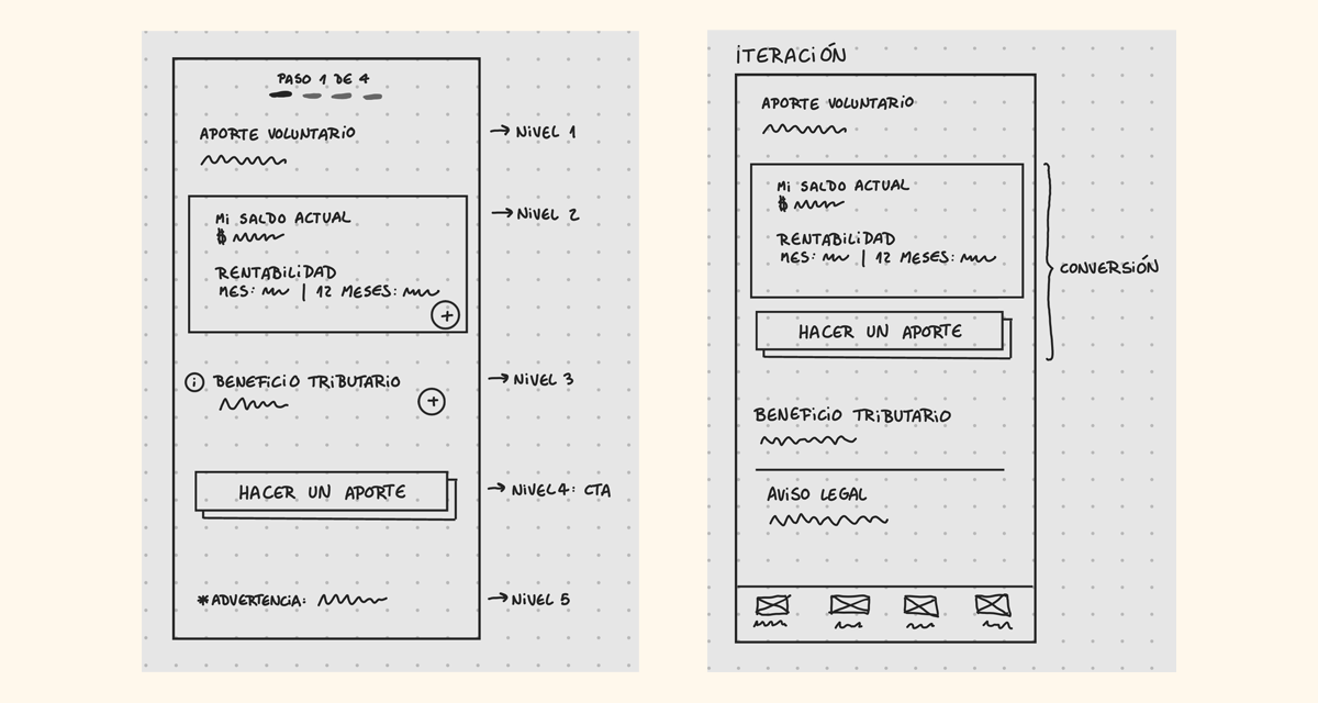
Wireframes of the design. I created an initial proposal and then, after starting the prototype, conducted a second iteration to improve the hierarchy.
- Orientation: A top linear stepper that mitigates anxiety throughout the process.
- Validation: Accumulated balance and profitability take center stage visually.
- Encouragement (Stimulus): Legal benefits are translated into friendly, everyday language.
- Direct Conversion: The primary button is strategically positioned next to the balance block, ensuring above-the-fold visibility and eliminating scroll dependency.
- Regulatory Compliance: Legal and regulatory disclaimers were moved to a secondary block at the end of the experience.
Additionally, I implemented an Empty State design for users without previous savings, replacing the blank interface with an empathetic "sowing" illustration that reframes the zero state as a positive starting point. All of this was built under strict WCAG AA accessibility standards using reusable components with variants in Figma.
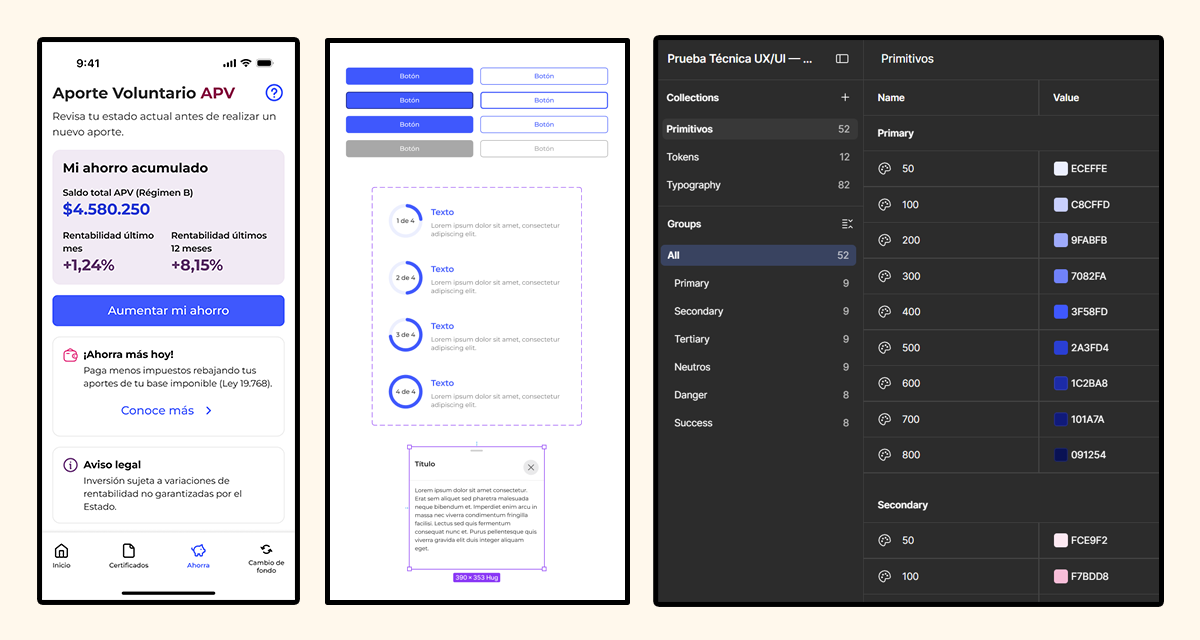
Finalized screen design, some created components, and color variables.
5 Results & Projected Impact
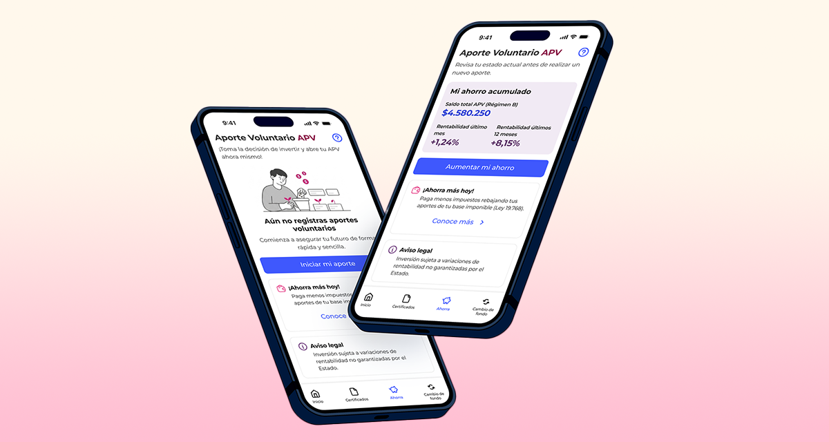
Final prototype in its default and empty state versions.
The final result was a clean, scalable interface solution strategically aligned with the administrator's corporate goals. The design framework is ready for usability testing in production environments.
This project proved to me that UX/UI design in the Fintech sector is not about hiding regulations or mandatory legal hurdles, but rather about intelligently reorganizing components and interactions to protect and guide the user's cognitive load.