Logo Proposal: 130th Anniversary Chile-Japan
Conceptual design of a commemorative logo for the Embassy of Japan, fusing the visual heritage of eki stamps and the national flora of both countries into a single historic brand.
1 The Challenge
The Embassy of Japan launched a call for proposals to design the visual identity for the 130th anniversary of the establishment of diplomatic relations between Japan and Chile. The challenge was to create a commemorative symbol that felt official, yet remained rich in genuine and emotional cultural significance.
The primary hurdle in this type of project is achieving a balanced visual synthesis. If you lean too far toward one country, the other takes a backseat. My goal was to design an isotype operating under a concept of unity and symmetrical reciprocity, telling a story of over a century of friendship through art.
Project Goals
- Synthesize the union of Chile and Japan without falling back on generic or disjointed visual resources.
- Respect the solemnity of the diplomatic anniversary while maintaining an artistic and human touch.
- Develop a versatile brand system, capable of working on everything from official stationery prints to engravings on commemorative plaques.
2 Conceptualization & Process
As an independent designer, I decided to approach the process by researching Japan's traditional visual codes. That is where I connected with the aesthetic of eki stamps: collectible stamps found at Japanese train stations and tourist spots, characterized by their handcrafted, circular, and synthesized illustration of a place's essence.
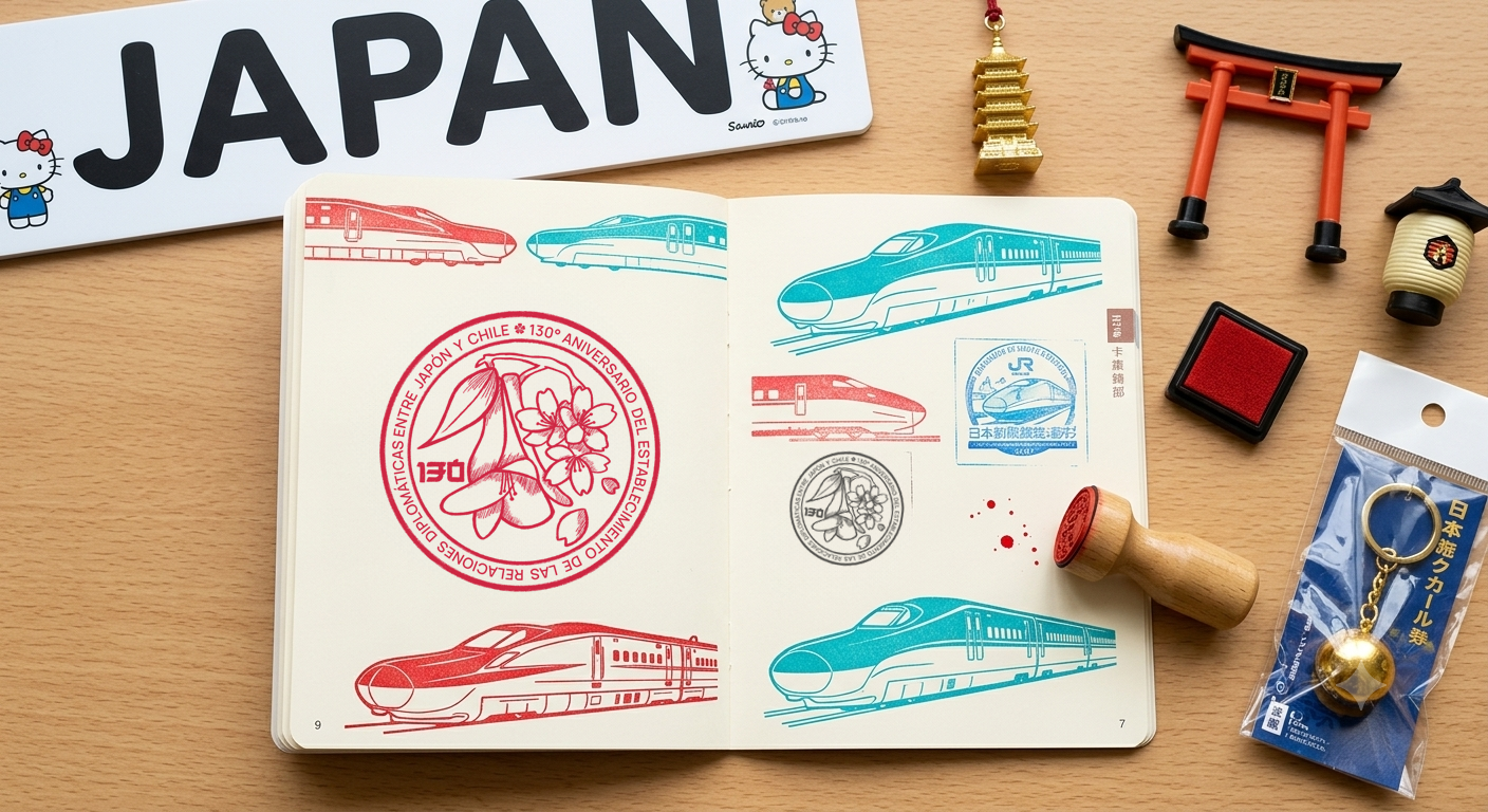
Mockup of the logo applied as an eki stamp.
To represent each country organically and subtly, I chose to work with their national flora. Thus, the Chilean Copihue and the Japanese Cherry Blossom (Sakura) became the main elements. I illustrated the logo in Hipaint, aiming to emulate the imperfect and vibrant texture of hand-stamped ink on paper.
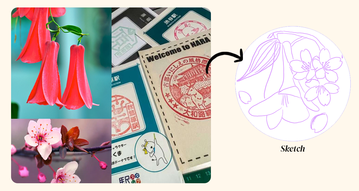
The Chilean copihue illustrated on the left and the cherry blossom (sakura) on the right, showing how both floral elements intertwine harmoniously at the central node of the final seal design.
3 Design Proposal
The final solution is a classic circular seal that frames nature and shared history. The key elements of the composition are:
- Stroke and Counterpoint: The two flowers do not merely coexist; they stem from the same central branch, symbolizing that the growth and development of this diplomatic relationship is built upon a common foundation of mutual respect.
- Typography and the 130: On the left side, I integrated the number "130" using a geometric, robust style reminiscent of traditional Kanji character structures, balancing the organic design of the flowers.
- Perimeter Text: An outer ring frames the composition with the official phrase in Spanish: "130° ANIVERSARIO DEL ESTABLECIMIENTO DE LAS RELACIONES DIPLOMÁTICAS ENTRE JAPÓN Y CHILE", sealing the design with an institutional and commemorative character.
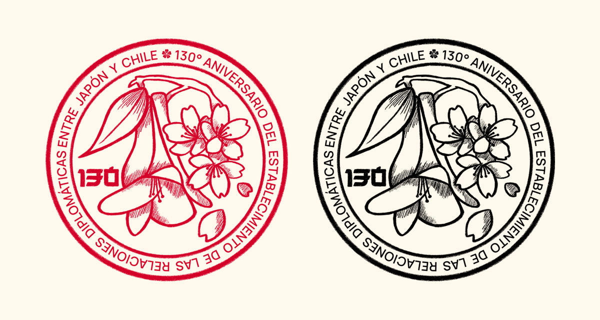
Final version of the logo in its color version (red as the common color of both countries and ink traditionally used in eki stamps) and its black version.
4 Brand Application & Flexibility
A good institutional logo must survive on any medium. Designing solely for digital spaces is a mistake, especially for an embassy where protocol demands applications on high-end physical mediums, official stationery, and commemorative events.
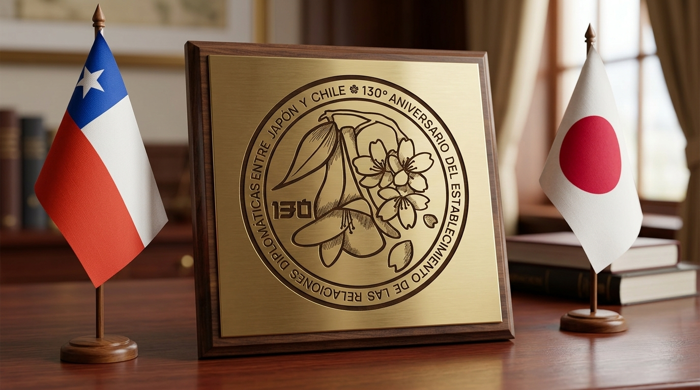
Institutional mockup where the design is engraved on a polished bronze metal plaque mounted on wood, placed next to the desktop flags of Chile and Japan in a diplomatic setting.
The logo was conceived with a monochromatic logic (traditionally in carmine red, evoking both the Japanese stamp and the colors of both countries' flags). However, its clean linework allows it to be seamlessly translated into industrial production techniques without losing legibility or visual impact.
5 Results & Learnings
This project represented a massive exercise in conceptual synthesis. It proved to me that commemorative identity design does not need to be cold or ultra-corporate to support an institutional role. By integrating digital illustration techniques with a concept rooted in Japanese artistic tradition and my country's flora, I achieved a proposal with identity, soul, and respect for the history it seeks to celebrate.